


1
2
3
4
5
6
7
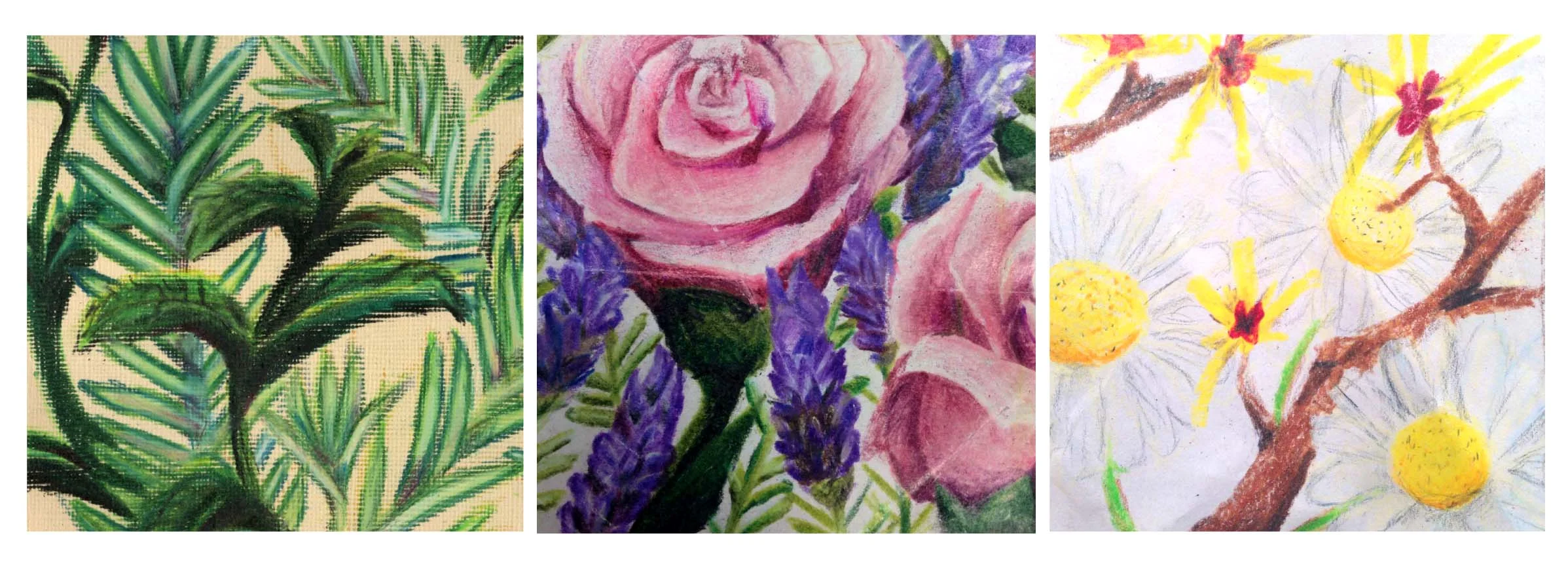
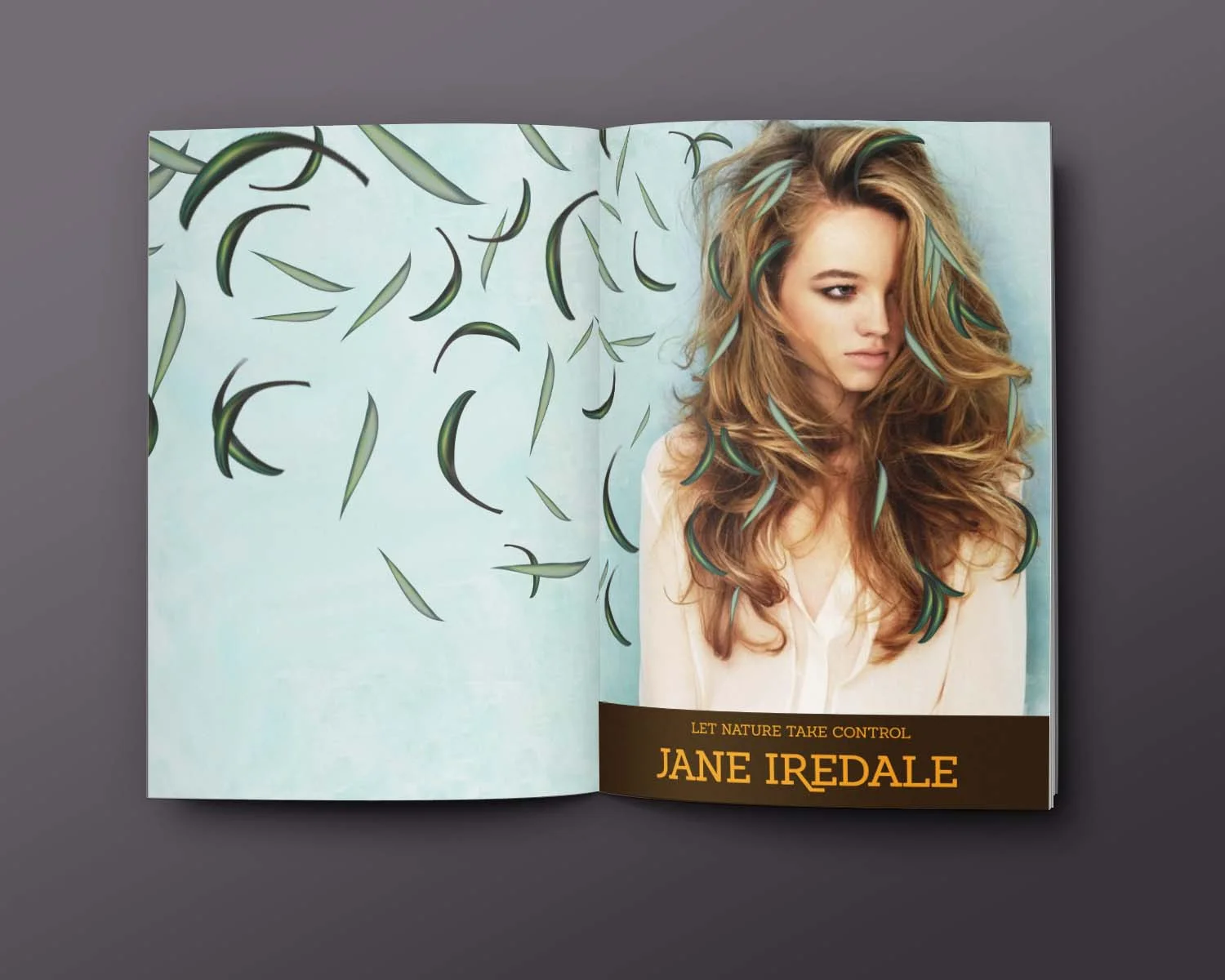
In a workshop with Interbrand’s Cincinnati office, I was asked to create a hypothetical rebranding of Jane Iredale’s hair care line. Jane Iredale’s mission is to create cosmetic products that provide skin care benefits with as much organic elements as possible.
I was inspired by the rawness of organic and natural products that Jane Iredale’s brand aims to use, and wanted to reflect that in my labels. I wanted to focus on the ingredients used in each product, and allow my wild colored pencil depictions of each scent to enhance the user’s bathing experience. I created a very simple typographic logo that is used as a band across the packaging of each product.